 Perfil
Nombre: Leticia Badía Torrente
Edad: 21 años
Carrera: Filología Inglesa, 4º
año
E-mail: lele@alumni.uv.es
Second Paper
I Have Said Something about Storyspace vs HTML
An analysis of the tools used in I Have Said Nothing by J. Yellowlees Douglas
Menu:
1. Introduction
The author
Jane Yellowlees Douglas has been researching hypertext and interactive fiction for more than 10 years. She studied at the University of Michigan and received her PhD from New York University. She spent a year as a Research Fellow at Brunel University in London and worked as a copywriter for Graham & Gillies Advertising, acted as a partner for Garrison Gibbs Communications served as an Assistant Professor of English and director of the program in professional writing in Lehman College. Now she works as the Director of the Center for Written and Oral Communication at the University of Florida. Her critical work on hypertext has been published in several journals and collections in the US, UK and Australia.
Her current homepage with her contact details is hosted at the University of Florida.
A more complete, extended biography can be found here.
Her works
J. Yellowlees Douglas has written two books and several articles.
Her first book, The End of Books or Books Without End, is an essay in which the author examines how interactive fiction works and also discusses the current state of hypertext criticism. It's available for reading in Google Books.
Her second work, I Have Said Nothing, is a short story about the consequences of two car accidents. It's an hypertext published by Eastgate. The CD-ROM with the story and the software needed to read it can be purchased from the publisher's website.
Most of her articles on hypertext and new technologies applied to academical research can be downloaded from her prior homepage.
This work
I Have Said Nothing, written by Jane Yellowlees Douglas, was originally published in 1994 by Eastgate Systems.
Eastgate Systems was the first company to publish electronic literature and hypertext. It was created in 1982 by Mark Bernstein, a well-known figure in hypertext research. Jay David Bolter, Michael Joyce and John B. Smith worked for the company and created one of the first and most important hypertext system, Storyspace, in which much early hypertext fiction was written. Eastgate is also responsible for Tinderbox, a tool for managing notes and information. The company still operates in its headquarters in Watertown, Massachusetts.
The story explores the deaths by car accident of Sherry and Jule, two former girlfriends of the narrator's brother. Depending on which path you choose, you can learn about the technical details of their death, the brother's reaction or the narrator's reflections on the accidents, often compared to famous movies and cartoons.
[top]
2. This version
Tools
The original short story was created with Eastgate's tool Storyspace, which allows writers to create their hypertexts in a fast and easy way. Storyspace is sold online at the producer's website. In order to read the story you must purchase the CD-ROM and execute the installation file that comes with it. Then you can start reading the story; the program will remember your choices and guide you efficiently through the paths you select. You can learn more about Storyspace here.
 Storyspace screenshoot |
However, what I'm going to analyze is a free excerpt hosted at W. W. Norton & Company, installation-free and which only uses basic web technology, meaning it has lost most of the advantages Storyspace offers, such as not being able to follow a semi-guided path and thus becoming somewhat chaotic. The author was fully aware of this and decided to provide a basic explanation of the navigation system, which will be explained in the following sections.
 HTML navigation version |
The tool used to create and publish this free excerpt was Adobe PageMill 2.0 Mac, one of the first WYSIWYG HTML editors, published by Adobe in 1996.
Before reading
The author advises us to read the instructions before starting with the story by putting a visible link to the instructions page at the top of the page.
She first tells us about the differences between the original product and this version:
"The original version of "I Have Said Nothing" was designed to enable readers to navigate through the narrative using a variety of strategies: by using the cognitive map, selecting hot words in the text, relying on narrative defaults (the hypertext equivalent of print's narrative line), or viewing a menu of available paths. Unfortunately, it's presently virtually impossible to replicate on the Web the system of guardfield conditions that enabled readers to see as options only those paths which took them to destinations that had some meaning, some relevance due to where they'd already been. Nor is it possible for readers to explore the full complexity of the narrative--or the possibilities for interaction that accompany each segment--in this excerpt. In the full-blown version of "I Have Said Nothing," for instance, you can't stumble onto the death throes of a character and find yourself wondering, not only who the hell she is, but why you should give a good goddamn because the guardfields, the Boolean strings that specify what conditions you need to have satisfied in order to have the choice of exploring this path or that one, ensure you don't as much as glimpse these options until the narrative has prepared you for them."
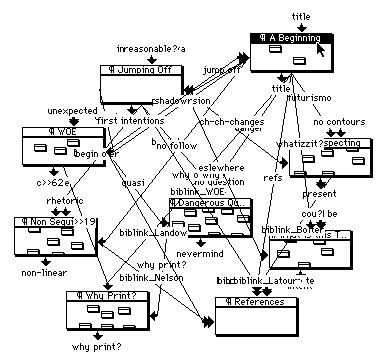
Then she proceeds to explain how the navigation problem has been minimized by adapting the original options to the net limitations: she has used the same navigation images that appear in Storyspace.
 Storyspace images |
Everyone intending to read the story should first take a look at the instructions.
[top]
3. Analysis
General layout
This hypertext contains two basic types of layouts: the story layout and the navigation map layout.
 Story layout |
The story layout is the most important of the two, since it gives form and body to the story we are reading. There are five clearly distinct elements configuring this layout:
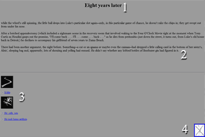
1. Title: In the main page this element shows the title of the story, with the author's name written in the subtitle. Once you click on a link and begin navigating, the title reads the name of the link you have just clicked, for example, if you click on "He was holding her feet", the link directs you to a new page of the story which title is "He was holding her feet". The title can either stand on its own, as seen in the former example, or directly connect to the story as in "He took some artifacts" and "Later". There are times in which the title emphasizes what follows, as can be seen in "Every One" and "No body". Little variation is found in this first element.
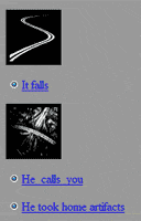
2. Story: The narration of the events, organized in paragraphs aligned to the right, without indentation and usually written in black ("It falls"). There are also special passages aligned to the center, they're short and need to attract attention ("We could say"). Some of them use two different fonts and colours ("He calls you") or are written in different colour together with the title ("Then it hits you"). Two pages use an image instead of written text, probably because they use non-traditional fonts ("You sit, you think" and "A Story") This element presents a great deal of variation.
3. Navigation menu: As explained in the last section, the navigation menu is a graphic replica of Storyspace's. It's always below the story, aligned to the left, although there's a single page that has it aligned to the center, "At Christmas", which can be considered as the starting point for the second path.
4. Map: A thumbnail image leading to the second basic layout. It always appears aligned to the right.
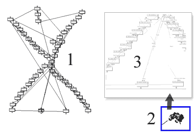 Navigation layout |
This second basic navigation depends on the first one. It's not really important, only a map for people who are confused or want to check which stage they're in. Being a short excerpt, this short of blurry navigation map wasn't really needed. Its three main elements are:
1. Global map: The thumbnail which can be seen in the previously analyzed layout. It shows all the pages of the story and how are they connected forming paths. The page you're currently in appears colored in black.
2. Binoculars: Similar to the map thumbnail image, you can click on it if you're still confused about your location. It will take you to a new page.
3. Zoom-in map: This close-up is clearer and allows you to read the titles of the pages surrounding yours.
Navigation
The navigation system is easy, clear and predictable. The options are arranged by default links and path options, each represented by a little icon:
 -
image27.gif -
image27.gif- 72x117px - 627 bytes - resized to 50x50px |
 -
image28.gif -
image28.gif- 75x50px - 2,55 kb - resized to 50x50px |
The options are coded using basic HTML inputs:
There are 119 HTML files to navigate, which make a total of 157 kbs:
- 56 navigation layouts worth 41,1 kbs
- 63 readable story pages, worth 116 kbs
Every page shares the same domain, http://www.wwnorton.com/college/english/pmaf/hypertext/ihsn/, adding its name, usually the same as its title, at the end.
Images
There's a total of 64 images that take up 1.74 mbs of space, 44 of which are GIF files and the other 20 JPEGs.
Most of the images are in grey scale, only one that works as if it were text uses dark red.
The little presence of images in the story helps non-broadband Internet connections to browse pages quickly.
Colors
There's a wide variety of colors on the site. Even if the images are only in grey scale, the background of the pages changes continously to match the mood of the story.
When you enter the main page, you're greeted by a loud red background which helps to create tension but fails at being pleasant to the eyes. If reading a computer screen is already tiring for your eyesight, this initial background makes you want to close the screen as soon as you can and forget about the story, specially if your brightness and contrast settings are set high. A temporary solution could be copying the text and pasting it on a text editor such as Word. Nowadays there are several scripts and codes which could be used to let the readers set their own backgrounds.
All this pain is forgotten as soon as we click on the first option and allow our eyes to adapt themselves to the new grey background which at this point looks like a blessing. It's only the beginning of the story, so there's no need to rush and start attracting attention.
As the story goes on, and after two or three clicks, we encounter a soft pink background which tells us that something is starting to happen. The name of this passage is "Anatomy". In my opinion, this choice of pink is related to the skin, flesh, muscles and bones, as the narrator starts talking about how your bones break when hit by a Chevy Nova with a 280 engine going 75 miles an hour.
Once she has told us it breaks everything inside you, including your head, the background turns black, as if our own heads had been broken and we could only see the double line written in yellow, as if it were the light at the end of the tunnel we wait for in anticipation. The next option is black as well, but with no text at all, as if we had failed and died.
The medical talk about how the brother's girlfriend died starts once again and the soft pink background reappears.
Then the narrator makes a mysterious comment related to something important that was said and the girl shouldn't have heard. This page uses dark red and white text to make it readable. The girl's being taken to the hospital on an ambulance, its lights and sirens are on, and she's bleeding from her ears. The used of dark red is justified by all those elements: ambulance, hospital, lights and sirens, blood.
All the reflections on death use a light blue background, they're comparisons to popular culture and match well with a calm colour. When she talks about how actors stay alive but their movie characters remain dead, the background turns darker, more cruel. It grows black as the narrator thinks about how much we enjoy thriller films, not wanting to realize how painful it'd be if it were real.
The alternating pages use the same kind of background color scheme.
All the paths end with a white background, both girls are dead, their stories have ended, but life still goes on.
Fonts
The only font used is the default browser's.
Some quotations use the tag <TT>, which makes the text look like it was written with a typewriter.
Two pages display a grunge font via image. This was probably done like that so everyone could see the same font without having to install it or making the browser change it to default if it wasn't.
[top]
4. Conclusion
This free excerpt has a good plot and a not-so-good design, although with the past decade's technology I guess this was one of the best ways the disadvantages could be solved.
I suppose that the full version of the story has a more appropiate choice of tools and it's easier to keep on reading the story without switching paths and missing important passages.
[top]
5. Sources
- http://www.wwnorton.com/college/english/pmaf/hypertext/ihsn/i_have_said_nothing.html
- http://www.cba.ufl.edu/contact/facultyinfo.asp?WEBID=2182
- http://writingcpr.com/?page_id=2
- http://www.nwe.ufl.edu/~jdouglas/
- http://www.eastgate.com/
- http://books.google.es/
- http://db.tidbits.com/article/6453
- http://en.wikipedia.org
[top]
© Leticia Badía Torrente desde 2009